Increase care initiation by 10%
Pointing designers
at what's worth building
My value isn't designing anymore — it's pointing designers at what's worth building. Redesigning our telehealth homepage, instead of opening Figma myself, I guided the team with a short list of things worth trying differently. The team had multiple real directions mocked up and prototyped in days — faster and better than if I'd built it myself.
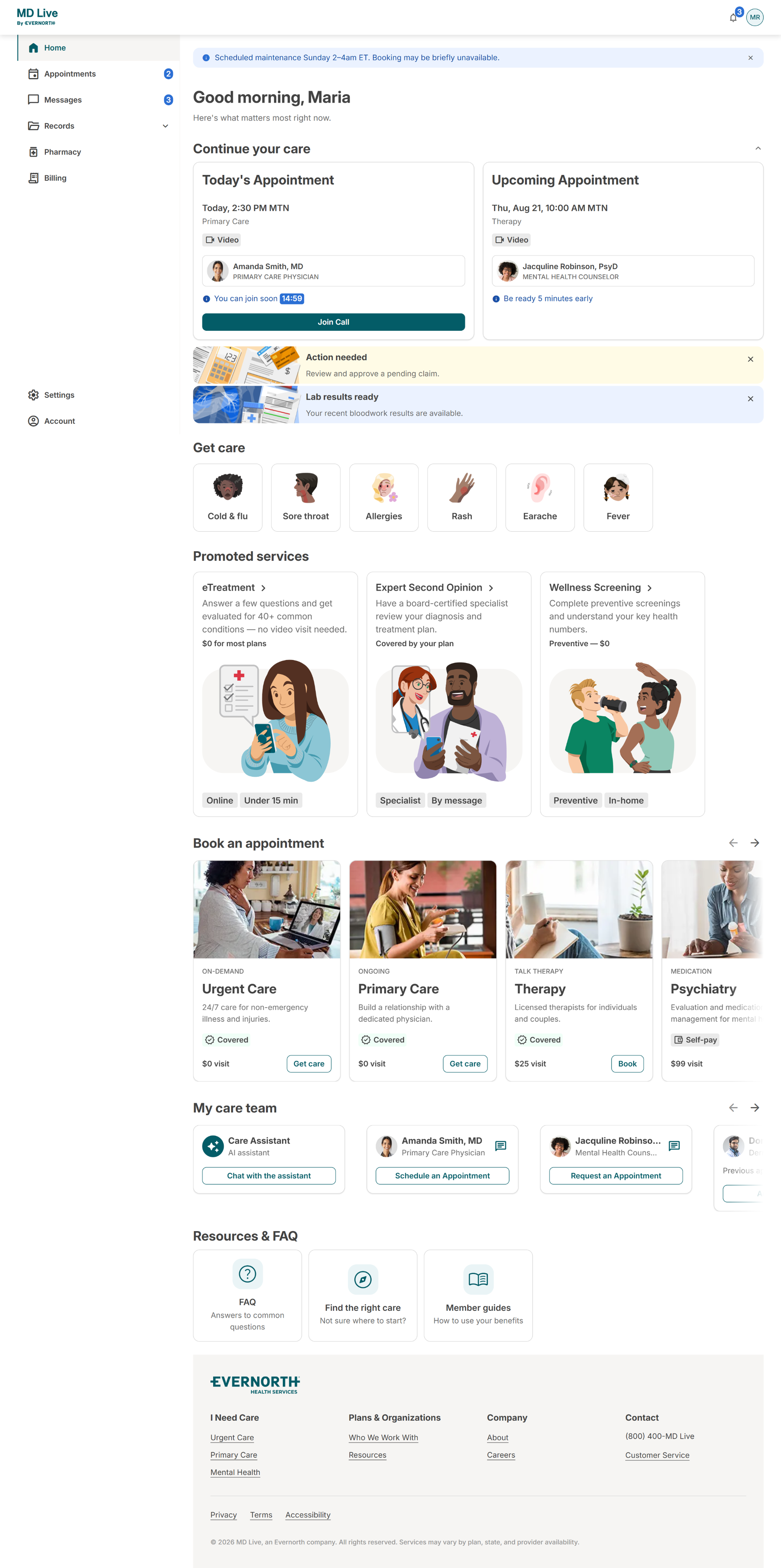
The home page
$3–4M incremental revenue
Problem
Patients arrive knowing what's wrong in their own words — "UTI," "ear pain," "sore throat" — but the product made them translate that into clinical language first. To start care, they had to choose a service line, then navigate a clinical chief-complaint list, then complete long intake steps, all before finding out if or when they could even be seen. That mismatch — symptom-first thinking meeting service-first design — was driving confusion, extra effort, and drop-off at the exact moment patients were most motivated to act.
We’re seeing a size able conversion gap, with only 80.7% of users who start the scheduling flow for UC completing the scheduling flow, in addition, only 37.9% of users who complete registration move forward with booking care
Hypothesis
We believe that simplifying how users identify their care need and guiding them toward the right service, care option, and visit type — rather than requiring them to already know which to pick — will increase progression, because users enter with symptoms, not service knowledge, and lack clarity on how to translate that into a choice.
What shipped
Reason-for-visit shortcuts — one-tap, plain-language chips ("UTI & Bladder," "Sinus & Nasal," "Cold, Flu & COVID") on both the authenticated home page and unauthenticated landing pages, with logic by age and sex assigned at birth
Care Companion (symptom search) — a free-text entry point for patients whose symptom wasn't on a chip, matching natural language ("my stomach hurts") to the right complaint and pathway
Promote Programs & Modality cards — surfacing e-treatment and programs like Weight Management for patients who didn't know those options existed
Unauthenticated landing pages v1 — modernizing the true front door so patients could see what MDLIVE offers and start moving toward care before ever logging in
User testing
KPI result
The booking process
100K+ additional annual visits
Problem
Hypothesis
We believe that reducing friction across the scheduling flow — effort, clarity, technical issues, and perceived necessity — will increase completion, because we see progressive abandonment at multiple points once users have already shown intent.
What shipped
AI triage, schedule steps, IVR.
KPI result
Missed and canceled visits
83% RECOVERY RATE
Problem
Urgent Care patients who miss their appointment have no simple way to resume their visit. Instead, they must restart scheduling and re-enter the queue as a new visit, creating unnecessary recovery friction.
Most patients recover shortly after a missed appointment, creating a critical recovery window. However, some patients never return, suggesting recovery friction may contribute to avoidable drop-off.
This matters because unnecessary recovery friction may prevent patients from completing care and reduce urgent care utilization.
Hypothesis
We believe that allowing patients to continue their visit without starting over will reduce recovery friction, increase return-to-care, and improve urgent care utilization.
What shipped
Omnichannel messaging.
KPI result
83% recovery rate